
FrootDrink Mobile App
FrootDrink is a comprehensive drink experience that bridges the gap between digital and physical consumers. This alternative to soda gives customers a healthy and fun drink that will offer a certain freedom that you can’t find anywhere else.
Software used in this project: Adobe Illustrator, Adobe Photoshop

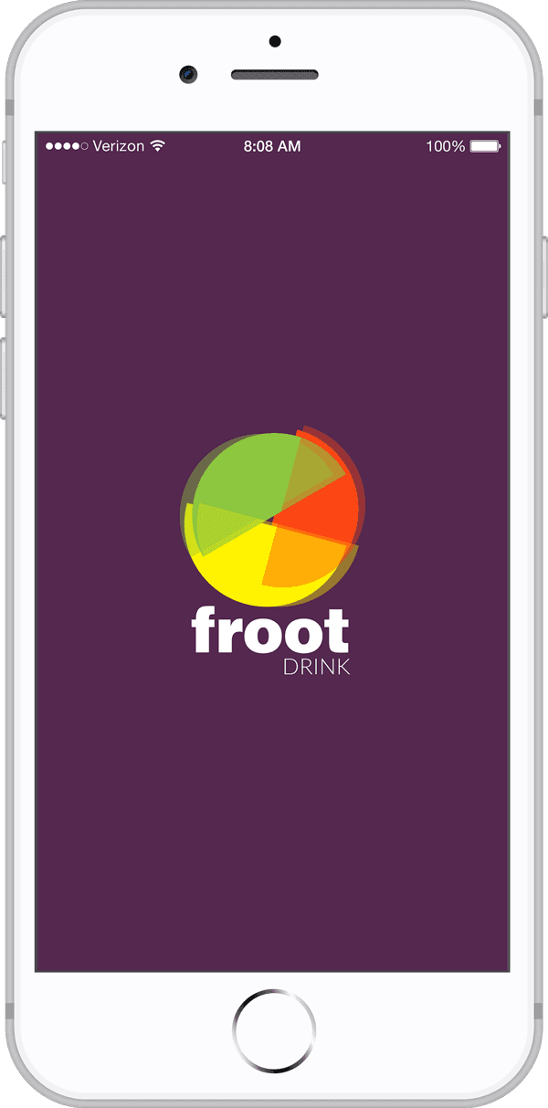
This project promotes being healthy and active. The logo design symbolizes the freedom to mix your fruit flavors but also reinforces active living. Each color of the logo, represents a different flavor of the FrootDrink.

The 4 colors that make up the logo are the core colors throughout the brand. Each of these colors are mixed to create the other colors you’ll see in the app. The mixing of colors also symbolizes the mixing of flavors within the app.

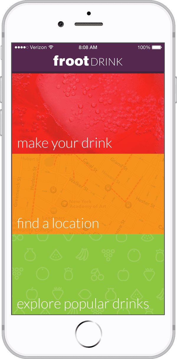
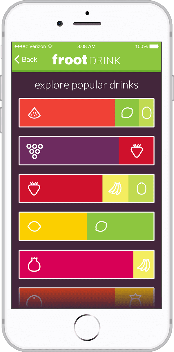
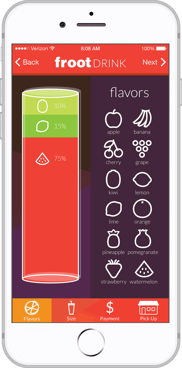
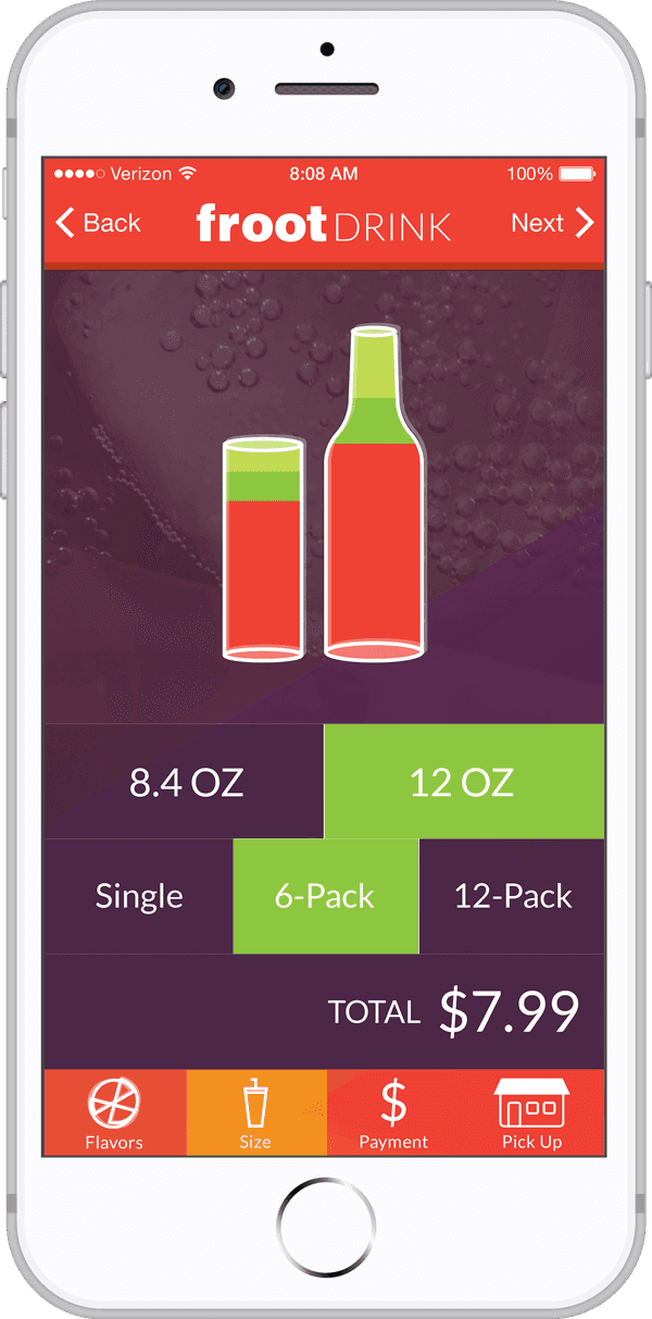
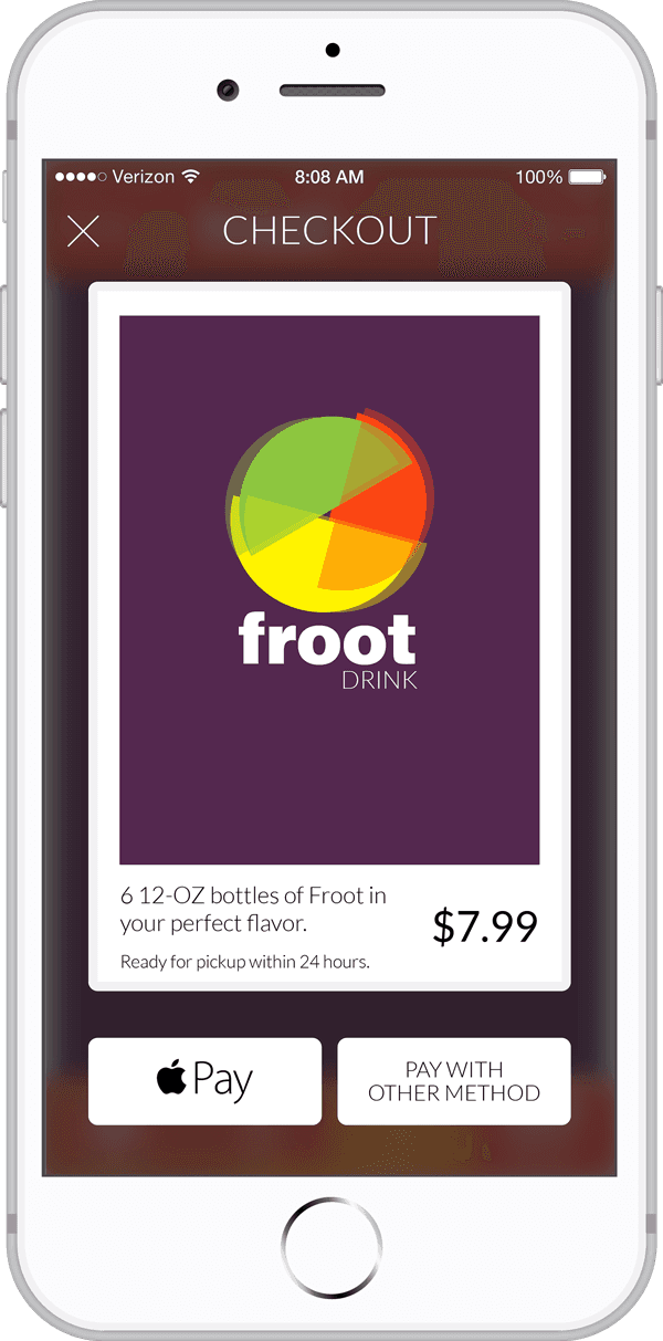
The app lets you choose from more than 10 different types of fresh fruit to make a unique drink. Then you can order the drink from inside the application and pick it up in the retail space.